


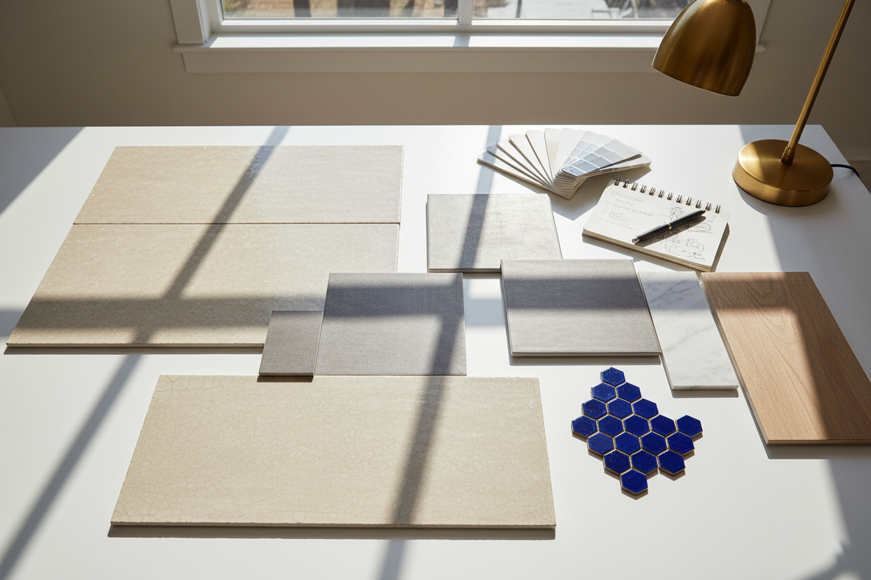
Quick Answer: How to Choose Tile Colors
Creating cohesive tile color palettes starts with a hero tile (the surface you love most), then balancing your space with the 60-30-10 rule: 60% main, 30% supporting, 10% accent. Confirm undertones (warm vs. cool) against fixed finishes, such as countertops and flooring, then evaluate samples in natural and artificial light. This guide covers core color theory, seven curated designer tile palettes, and a step‑by‑step workflow—plus shoppable links to ceramic tiles, natural stone tiles, and distinctive feather tile accents.
Designer Tip: View wall tiles vertically and floor tiles flat on the ground; angle them under task lighting to see glare and undertone shifts.
The 3 Principles of a Perfect Tile Palette
1) The 60-30-10 Rule
A resilient framework for tile color combinations. Assign your main surface (60%) to the largest plane—often floors or the primary wall. Your secondary (30%) supports with a calmer color or complementary texture. The accent (10%) injects character via pattern, luster, or hue. This proportion keeps tile color palettes balanced, whether you prefer modern minimalism or layered traditional schemes.
2) Consider Undertones
Whites skew warm (cream, bone) or cool (blue, silver). Stones carry taupe, green, or gold undertones; glazes can flash multiple tones. Match warm with warm, cool with cool, or bridge them using a neutral mid‑tone. Reading undertones correctly is the fastest way to avoid clashes in tile color palettes for kitchens and baths.
3) Light Is Everything
Morning daylight is cooler; evening light and warm bulbs shift colors to richer hues. Glossy glazes bounce light, while honed stone absorbs it. Always test samples across the day and under your actual bulbs to validate tile color palettes before ordering.
Beyond these fundamentals, current trends highlight textured and sculptural tiles—such as relief and fluted finishes—to add dimension and an artisanal touch. Large-format porcelain slabs with minimal grout lines are also popular for creating seamless, expansive looks, especially in small spaces. Sustainable materials and handcrafted glazes are increasingly sought after for their eco-friendly appeal.
7 Curated Designer Palettes

Each palette follows 60‑30‑10 and links to Mosaicenter categories so you can shop immediately. Use alt text and descriptive filenames when you upload images for SEO.
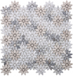
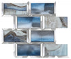
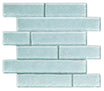
Palette #1: Serene Coastal Retreat
Image:coastal-serene-tile-palette.jpg (alt: Coastal palette with white ceramic, sea‑glass hex, sandy stone)
The Vibe: Calm, airy, resort‑fresh.
The Palette:
- Main (60%) — Warm white field → Ceramic Tiles
- Secondary (30%) — Soft blue‑green glass hex → Glass category
-
Accent (10%) — Beige limestone mosaic niche → Natural Stone Tiles
Best For: Light‑filled kitchens, spa baths, coastal entries.
Shop the Palette →Mosaicenter
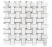
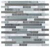
Palette #2: Modern Monochromatic
Image:modern-monochrome-tile-palette.jpg (alt: Monochrome with matte porcelain, warm‑grey ceramic, charcoal mosaic)
The Vibe: Sleek, gallery‑quiet, modern.
The Palette:
- Main (60%) — Light‑grey porcelain floor → Porcelain category
- Secondary (30%) — Warm‑grey ceramic wall → Ceramic Tiles
-
Accent (10%) — Charcoal mosaic band → Mosaic category
Best For: Open‑plan living, minimalist baths, small spaces needing cohesion.
Shop the Palette →Mosaicenter
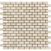
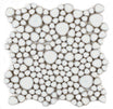
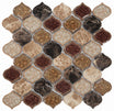
Palette #3: Earthy & Grounded
Image:earthy-grounded-tile-palette.jpg (alt: Travertine floor, clay‑tone ceramic wall, handmade‑look mosaic)
The Vibe: Warm, textural, organic.
The Palette:
- Main (60%) — Honed travertine → Natural Stone Tiles
- Secondary (30%) — Terracotta‑wash ceramic → Ceramic Tiles
-
Accent (10%) — Handmade‑look mosaic → Mosaic category
Best For: Mudrooms, farmhouse kitchens, rustic powder rooms.
Shop the Palette →Mosaicenter
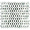
Palette #4: Bold & Contrasting
Image:bold-contrast-tile-palette.jpg (alt: Black porcelain floor, white marble wall, metallic mosaic accent)
The Vibe: High‑contrast, dramatic, editorial.
The Palette:
- Main (60%) — Satin black porcelain → Porcelain category
- Secondary (30%) — Fine‑vein marble → Natural Stone Tiles
-
Accent (10%) — Mixed‑metal mosaic → Mosaic category
Best For: Black‑and‑white kitchens, bold foyers, statement baths.
Shop the Palette →Mosaicenter
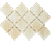
Palette #5: Timeless Neutrals
Image:timeless-neutrals-tile-palette.jpg (alt: Beige porcelain, ivory ceramic wall, taupe micro‑mosaic)
The Vibe: Soft, elegant, resale‑friendly.
The Palette:
- Main (60%) — Beige porcelain floor → Porcelain category
- Secondary (30%) — Ivory ceramic wall → Ceramic Tiles
-
Accent (10%) — Taupe mini‑mosaic → Mosaic category
Best For: Rentals, family homes, long‑horizon renovations.
Shop the Palette →Mosaicenter
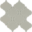
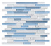
Palette #6: Modern Farmhouse Harmony
Image:modern-farmhouse-tile-palette.jpg (alt: Warm white ceramic, muted sage subway, aged bronze accent)
The Vibe: Cozy, collected, fresh.
The Palette:
- Main (60%) — Warm‑white ceramic field → Ceramic Tiles
- Secondary (30%) — Muted sage subway → Backsplash category
-
Accent (10%) — Patinated feather tile detail → Feather Tile
Best For: Farmhouse kitchens, laundry rooms, breakfast nooks.
Shop the Palette →Mosaicenter
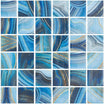
Palette #7: Mediterranean Warmth
Image:mediterranean-warmth-tile-palette.jpg (alt: Patterned floor, creamy ceramic wall, cobalt mosaic accent)
The Vibe: Sun‑kissed, patterned, convivial.
The Palette:
- Main (60%) — Patterned/terracotta floor → Natural Stone Tiles
- Secondary (30%) — Creamy ceramic wall → Ceramic Tiles
-
Accent (10%) — Cobalt mosaic → Mosaic category
Best For: Covered outdoor kitchens, cafés, lively family spaces.
Shop the Palette →Mosaicenter
A Designer’s 4-Step Guide to Building Your Palette

Follow this tile color guide to create confident tile color palettes for any room:
1. Find Your Hero Tile
Pick the material or pattern you love—marble veining, artisan glaze, or geometric mosaic. Everything else should support it.
2. Pull Undertones for Harmony
Lay samples next to the paint and counters. Warm pairs with warm; cool with cool. If you must mix, bridge with a mid‑tone neutral.
3. Use the Color Wheel
- Analogous (neighbors) → calm cohesion.
- Complementary (opposites) → vivid contrast.
-
Triadic (evenly spaced) → lively, balanced.
This logic scales from baths to living rooms without breaking your palette.
4. Get Samples & Test
Order samples and test them using lightbox setups or under both natural and artificial light at different times of day to validate color and undertone accuracy. Incorporate grout sticks for real-time grout color pairing and consider digital visualization tools to reduce guesswork. Gloss vs. matte, grout spacing, and slip ratings matter too.
Order Your Free Tile Samples Today →Mosaicenter
For optimal outcomes, leverage advancements in sampling, such as light-responsive kits and digital visualization, to ensure colors and undertones remain consistent under various lighting. Be mindful of challenges like pattern alignment with textured tiles, and use the hero tile method to streamline decisions and reduce waste.
Designer Tip: Bring grout sticks into the conversation early. A darker grout outlines shapes; a tone‑on‑tone grout softens pattern and can make small rooms feel larger.
Conclusion & Consultation
Choosing colors isn’t guesswork—it’s a method. Start with the surface you love, apply 60‑30‑10, align undertones, test in real light, and refine with grout. With these tile color palettes, you’ll confidently move from inspiration to installation.
Book Your Free Design Consultation →Mosaicenter
Explore All Color Collections → Browse ceramic tiles, natural stone tiles, and statement feather tile.
FAQs
Q: Should floor and wall tiles match?
Not precisely—they should coordinate. Keep undertones aligned and vary scale or sheen (matte floor + gloss wall) for depth.
Q: What tile colors make a small room look bigger?
Light, low‑contrast tile color palettes with larger formats reduce grout lines and visually expand the space.
Q: How do I choose a grout color?
Match the grout to soften the pattern; contrast to highlight the geometry. Consider stain‑resistant or epoxy grout in heavy‑use zones.
Q: What are the most timeless tile colors?
Soft whites, beiges, warm grays, and classic black‑and‑white pairs anchor tile color combinations across decades.

Halil I Oguz
At Mosaicenter's, Halil I Oguz brings a unique blend of strategic insight and creative flair to our digital experience. As our dedicated Founder & Tile Expert, he masterfully curates the online journey, allowing the inherent quality and design artistry of our premium tiles to truly shine.
From showcasing the intricate patterns of our mosaics to detailing the robust, scratch-resistant and water-resistant finishes of our porcelain and natural stone, Halil crafts content that is both informative and deeply engaging.
His work empowers Mosaicenter's clients to confidently select from our extensive range, helping them transform spaces with tiles that reflect both enduring style and practical excellence.
Leave a comment
This site is protected by hCaptcha and the hCaptcha Privacy Policy and Terms of Service apply.