


30-Second Summary
- Choose based on visual volume first: calm (Dolomite) vs expressive (Carrara).
- Let the room decide: the backsplash, shower, and floor each favor different finishes and formats.
- Honed finishes tend to be more forgiving; polished finishes read brighter but show marks sooner.
- Samples in your own lighting are the fastest way to avoid undertone regret.
White marble is one of those choices that feel simple until you start comparing options. If you’re searching for dolomite vs carrara marble, you’re likely aiming for the same result: a bright, timeless surface that looks elevated without turning into a daily worry.
The catch is that “white marble” isn’t one look. Veining, undertone, finish, and tile format can change the entire mood of a kitchen or bathroom. This guide walks you through what to expect from Bianco Dolomite and Carrara White, where each one typically performs best, and how to choose in a way that still feels right after the first few months of real use.
At Mosaicenter, we curate natural stone options that work for real homes. If you’re choosing between two classic whites, the easiest way to avoid regret is to compare samples in your own light, then choose the finish and format that fits your space.
What You’re Really Choosing
Most people think they’re choosing between two stones. In practice, you’re choosing between two design behaviors:
- How much movement do you want on the surface (quiet vs expressive)?
- Whether you want the stone to act as the “main character” or the supporting backdrop.
- How do you feel about natural variation and everyday patina?
A simple way to decide is to pick your preference on these three questions:
- Do you want a calm field of white, or do you want to see marble movement from across the room?
- Are your other finishes busy (strong wood grain, patterned counters, bold hardware), or are they minimal?
- Will the tile be in a high-traffic area where water, cosmetics, oils, or cooking splatter are common?
Quick Tip: If you already have one “statement” surface, let the second surface stay quieter. That’s how you keep the room from feeling visually noisy.
What are Bianco Dolomite and Carrara marble?

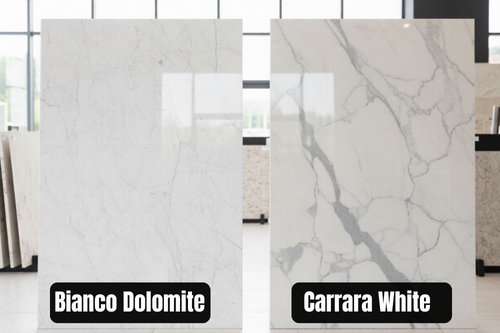
Bianco Dolomite is a white natural stone commonly sold as dolomite marble, known for a bright background and soft gray veining that often reads as controlled and refined. Carrara White is a classic Italian white marble look associated with Carrara, valued for its recognizable gray veining and traditional character. In dolomite vs carrara marble comparisons, the real differences show up in undertone, veining “volume,” and how each finish looks after daily use.
What Differences Matter Most?
If you’re still weighing dolomite vs carrara marble, pause here and decide what you want the surface to do: blend in quietly or add visible movement. The table below makes that tradeoff clear.
Use this table as a decision shortcut. The “winner” changes based on the room and the look you want.
|
Category |
Bianco Dolomite |
Carrara White |
|
Overall mood |
Clean, calm, controlled |
Classic, expressive, traditional |
|
Veining |
Softer and often less busy |
More visible movement and variation |
|
Undertone tendency |
Often reads bright/neutral |
Often reads cool/gray-leaning |
|
Finish behavior |
Honed reads very soft; polished looks crisp |
Honed looks classic; polished reads high-contrast |
|
Best quick-fit spaces |
Minimal kitchens, quiet baths |
Feature backsplashes, statement baths |
|
Maintenance reality |
Both can be etched and benefit from sealing |
Both can be etched and benefit from sealing |
Designer Tip: If you’re torn, decide based on “visual volume.” Pick the one that feels right from 8–10 feet away, not just up close.
How Each Marble Looks Once It’s Installed
A showroom photo can’t tell you how a tile will read under your lighting and next to your cabinetry. Here’s the most useful way to describe the look.
Bianco Dolomite: Typically calmer movement, cleaner read
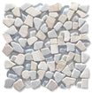
When people choose bianco dolomite marble, it’s usually for a brighter, more uniform backdrop. If you’re browsing options, start with the bianco dolomite collection and compare formats side by side. The veining tends to feel softer and less “busy,” which helps in kitchens with many competing elements.
Best For:
- Bright kitchens that need a clean supporting surface
- Transitional spaces where you want quiet elegance
- Smaller rooms where heavy veining would feel crowded
Pairs Well With:
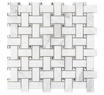
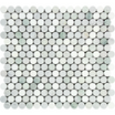
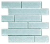
- Bianco Dolomite Marble Brick 1"x2" Mosaic Tile tight, timeless texture; great when you want detail without drama.
- Bianco Dolomite Marble Brick 2"x4" Mosaic Tile, a calmer “subway” rhythm in mosaic form; easy to live with visually.
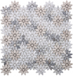
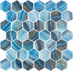
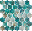
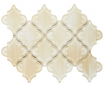
- Bianco Dolomite Moderno Polished Mosaic bold, graphic look with a more decorative feel (best as an accent zone).
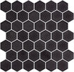
- Bianco Dolomite Marble Hexagon 2" Mosaic Tile crisp shape that adds structure without heavy contrast.
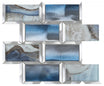
Carrara White: classic movement, Often more visible character
The appeal of white Carrara marble lies in its unmistakable marble identity. For classic formats and mosaics, the white Carrara marble tile collection is a helpful starting point. You usually see more linear movement and more variation across pieces, which can look beautiful when you want the wall or floor to feel “alive.”
Best For:
- Traditional and European-leaning interiors
- Feature moments where you want the stone to show
- Larger surfaces where veining has room to breathe
Pairs Well With:
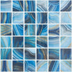
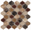
- Carrara White Marble Diamond Mosaic Tile (geometric, crisp, great when you want the marble to feel a little more tailored).
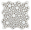
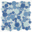
- Carrara White Marble Bubble Mosaic Tile (softer, more organic, nice for a bathroom niche or feature strip).
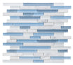
- Carrara White Marble 1"x1" Mosaic Tile (classic grid works when you want texture without a busy pattern).
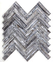
- Carrara White Marble Brick 1"x2" Split-faced Mosaic Tile (adds texture and depth best as an accent, not a full wall).
Naming note: Many suppliers use bianco carrara marble for this family of stone, and you may also see variations like carrara marble white in listings and searches. Focus on what you see in the tile itself: background tone, movement, and finish.
Which Rooms Suit Each Marble Best?
Different rooms reward different choices. This is where the decision usually becomes obvious.
Kitchen backsplash
A backsplash is mostly about visibility and cleanability. If your countertops already have strong movement, a quieter backsplash can look more intentional. If your counters are calm, Carrara can be the feature.
If you want a classic statement behind the range, Carrara white marble backsplash works well in simple layouts like subway, stacked, or a restrained herringbone. It reads “timeless” without needing bold colors.
Bathroom walls and showers
Bathrooms add water, steam, and skincare habits to the mix. If you’re collecting white carrara marble bathroom ideas, pay attention to the finish choice. A honed finish typically feels more forgiving in daily use and hides small etch marks better.
Dolomite can also be a strong bathroom choice when you want the space to stay bright and clean-looking. In tile form, especially bianco dolomite marble tile, it often reads smoother and less busy across shower walls.
Quick Tip: In hard-water areas, keep your routine simple. Squeegee when you can, and use gentle cleaners so the finish stays consistent.
Floors and high-traffic zones
Floors show everything: dirt, grit, and the light reflection that makes a surface look glossy or dull. For most homes, honed finishes feel more livable.
If you want a calmer floor that doesn’t visually “cut up” the room, Dolomite’s lower-contrast look often helps. If you want a more traditional marble identity, Carrara can be beautiful, especially in larger rooms where the veining has room to breathe.
Feature walls, niches, and accents
This is where Carrara shines. If you want the stone to feel like a design moment, choose a format that shows movement, such as hex, basketweave, or a classic 4x12 with a thoughtful grout color.
Dolomite accents work well when you want texture without drama. In a niche or a fireplace surround, it can feel refined and modern without pulling attention away from other finishes.
If you’re deciding from photos, it’s easy to miss undertones. Mosaicenter offers samples on request so you can compare color and texture at home before you commit to a full order.
Which Finish Is Easier to Live With: Honed or Polished?
Most “I wish I chose the other one” regrets aren’t really about the stone; they’re about the finish choice.
- Honed: softer, calmer, and honed can be more forgiving visually, but may show darkening from spills faster if not sealed well
- Polished: brighter, sharper, higher contrast, but it tends to show marks and dull spots sooner.
Quick rule:
- Want a spa-like bathroom that stays calm? Honed is usually easier long-term.
- Want a crisp, glossy look and don’t mind wiping more often? Polished can be worth it.
Do Tile Format and Grout Color Change the Marble Look?
Yes, this is the “third decision” that can make the same marble feel quiet or busy.
Does tile size change how busy the surface feels?
- Larger formats read calmer and more seamless.
- Smaller mosaics add texture and detail, but they also add grout lines so the surface looks more patterned.
If you’re aiming for “quiet luxury,” keep the format simple. If you want dimension, mosaics can be the moment, especially in niches or behind a vanity.
Should grout match or contrast?
- Tone-on-tone grout makes marble feel like one continuous surface.
- Contrast grout turns the layout into a visible pattern.
Quick rule:
If your room already has strong finishes, go tone-on-tone. If the room is minimal, a slightly deeper grout can add definition without feeling loud.
What Care and Sealing Should You Expect?
Both stones are natural. That means the rules are simple and consistent.
Daily:
- Wipe splashes and spills early.
- Use a soft cloth and pH-neutral cleaner.
Weekly:
- Clean gently, especially around sinks and showers where residue tends to build up.
- Watch for gritty debris on floors (that’s what creates micro-scratches).
Sealing:
- Sealing helps slow absorption, but it doesn’t make marble “stain-proof.”
- Re-test periodically: if water darkens the stone quickly, it’s time to reseal.
If you want help planning finishes across a whole project, Mosaicenter’s natural stone and tile collections make it easier to compare styles by application, size, and look without guessing from a single photo.
What’s the Simplest 3-Step Framework to Choose Confidently?
1) Visual volume (quiet vs expressive)
Start by deciding how much “marble movement” you want from 8–10 feet away. If you want the surface to feel calm and mostly white, lean toward Bianco Dolomite. If you want visible veining that reads instantly as classic marble, Carrara usually delivers that character more strongly.
Quick Tip: If your countertops, cabinets, or floors already have a strong pattern or grain, a quieter wall tile often looks more intentional.
2) Finish (how it will look after daily use)
Finish changes the entire experience.
- Honed looks softer and tends to hide small etch marks better.
- Polished looks brighter and higher-contrast, but it shows marks and water spotting sooner.
If you want the “always calm” look, honed is usually the easier long-term choice—especially in bathrooms and showers.
3) Room (choose by zone, not just by mood)
Now match the look to the space.
- Backsplash: both work well; pick based on whether you want the wall to be the feature.
- Shower walls: honed often feels more forgiving day to day.
- Floors: prioritize a finish and format that won’t look busy once grout lines are visible.
If you’re stuck between them, decide with your samples in the room where they’ll be installed. Lighting is the tie-breaker more often than the stone name.
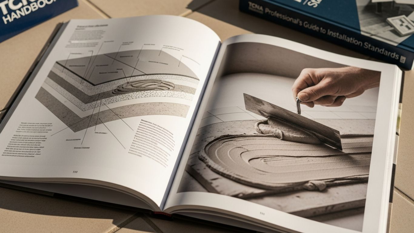
What Installation Habits Protect the Finished Marble Look?

You don’t need a long technical checklist. You need a few “pro habits” that prevent the common marble-tile regrets.
Blend before you set
Natural stone varies. Open multiple boxes and dry-lay a small area to evenly distribute the veining. This avoids one corner looking heavier or darker than the rest.
Prep for flatness (especially with larger formats)
Large tiles show substrate issues quickly. A flatter surface means less lippage, cleaner grout lines, and a more polished final look.
Use the right mortar for white stone
White marble can be sensitive to what’s behind it. Installers often prefer a white thinset to help maintain a cleaner, brighter read.
Dry-layout your “focal zones.”
Do a quick layout where the eye lands first behind the range, in a shower niche, or over a vanity. It’s easier to adjust cuts and balance veining before anything is set.
Seal with a plan, not hope
Confirm when sealing happens (before grout, after grout, or both) based on your installer’s approach and the product’s needs. The goal is consistent protection in the zones that get the most splashes.
Over to You
If you want a calmer, cleaner white that plays nicely with bold counters or busy finishes, Bianco Dolomite is usually the easier match. If you want a more classic marble look with visible movement that reads traditional and timeless, Carrara White is the better fit.
The fastest way to decide is to stop comparing photos and compare samples in your own lighting. Once the undertone and finish feel right, the “which one” question becomes obvious.
Explore both collections on Mosaicenter, order up to three free sample pieces, and reach out if you’d like help choosing finish, format, and grout before you place a full order.
FAQs
Q: Which looks more “Italian classic” in most homes?
A: Many people associate Italian white Carrara marble with the traditional marble look because the veining reads more visibly across a surface.
Q: What’s the simplest way to get the Dolomite look in a calm layout?
A: Use a field tile and keep the grout close to the background. If you want a brighter, cleaner read, a larger-format Bianco Dolomite field tile often feels more seamless.
Q: If I’m comparing dolomite vs carrara marble, which is easier to live with day-to-day?
A: They’re closer than most people expect. Finish choice matters more than the name: honed is typically more forgiving, and sealing plus quick wipe-ups keep either option looking good.
Q: Where should I start if I’m still unsure?
A: Start with a sample. Compare it next to cabinets and paint, then decide on the finish and format. Once the undertone is right, the rest of the design choices fall into place.

Halil I Oguz
At Mosaicenter's, Halil I Oguz brings a unique blend of strategic insight and creative flair to our digital experience. As our dedicated Founder & Tile Expert, he masterfully curates the online journey, allowing the inherent quality and design artistry of our premium tiles to truly shine.
From showcasing the intricate patterns of our mosaics to detailing the robust, scratch-resistant and water-resistant finishes of our porcelain and natural stone, Halil crafts content that is both informative and deeply engaging.
His work empowers Mosaicenter's clients to confidently select from our extensive range, helping them transform spaces with tiles that reflect both enduring style and practical excellence.

Leave a comment
This site is protected by hCaptcha and the hCaptcha Privacy Policy and Terms of Service apply.