


30 Seconds Summary
- Start by deciding if you want contrast grout to make your tiles pop or blending grout for a smooth, seamless look.
- White, gray, black, and wood-look tiles each go well with different grout colors. Choose the grout color based on your design goal.
- Medium-tone grout like gray, beige, or taupe is easiest to maintain and works in most rooms.
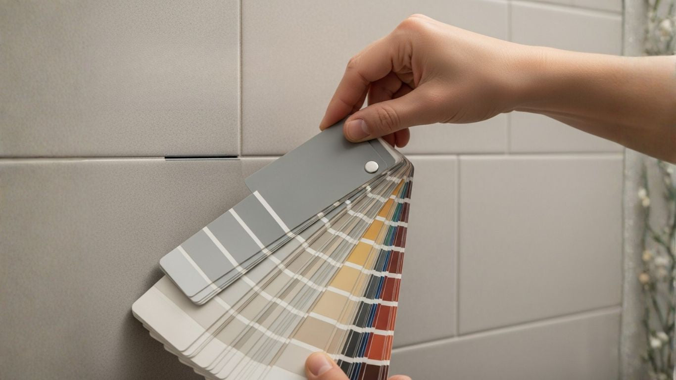
- Always test grout samples in your room’s lighting to make sure the final look matches your vision.
Choosing grout color can feel just as hard as picking the tile. You stand in the store, look at small color cards, and still can’t picture how it will look on your wall or floor. Many people worry they will choose wrong and ruin the whole design. That stress is real, and you are not alone in feeling it.
In this guide, we aim to make things easier for you. Instead of guessing, you will learn three simple pro rules that show you exactly how to choose grout color with less fear and more confidence. We will share clear examples and smart ideas that will make the choice feel simple and not scary.
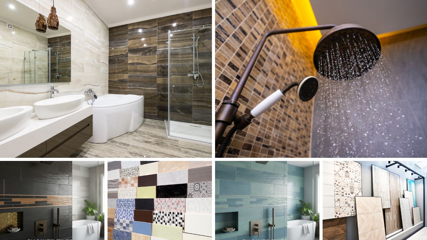
Grout is not just “the stuff between tiles.” It changes how your space looks, how big it feels, and how clean it stays. With the right grout color ideas, you can make tiles stand out or blend in softly.
Shop tile options that make choosing grout color easy at Mosaicenter.
Rule #1: Decide Your Goal - Create Contrast or a Seamless Blend?
Before picking any color, think about the overall effect you want in your space. Do you want your tiles to stand out, or do you prefer a smooth, seamless look? This choice will guide every step of choosing grout color for tile.
Choosing Contrast Grout (To Make Your Tile Pop)
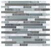
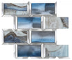
If you want your tiles to be noticed, contrast grout is your best friend. This means selecting a grout color that is lighter or darker than your tile. For example, using dark gray grout with white subway tiles or light grout with black tiles creates clear, defined lines that emphasize the tile shape.
Contrast grout works perfectly on patterns like herringbone, mosaics, or subway tiles. Your grout lines become part of the design, adding depth, energy, and a statement look to kitchens, bathrooms, or feature walls.
Designer Tip: Use contrast grout when you want your tile pattern to pop and become a visual focal point. For instance, grout for subway tile in a dark tone transforms a simple wall into a bold, graphic feature.
Choosing Blending Grout (For a Seamless, Unified Look)
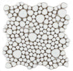
On the other hand, matching grout, i.e., grout that is close to the tile’s color, gives a seamless look. This approach makes the surface feel continuous and airy, ideal for small rooms or spaces where you want calm and simplicity.
Blending grout works especially well with large-format tiles, marble, or wood-look tile designs. Using a light or neutral tone like grey, beige, or off-white lets the tile texture shine and creates a clean, modern feel. It also helps visually open up a room and makes floors and walls appear larger.
Pro Tip: For busy areas, a medium-tone grout is practical. It blends nicely with the tiles and hides dirt well. Grey grout is a popular choice because it looks clean and is easy to maintain. It is a great idea for bathroom grout color ideas or kitchen backsplash grout colors.
Deciding early between contrast and a seamless blend helps you plan the whole look. This first step in your grout color guide makes picking the right color and style much easier.
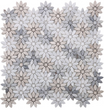
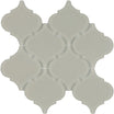
Rule #2: A Visual Guide: Popular Tile & Grout Combinations
Now that you know whether you want contrast grout or a blending grout, it’s time to explore tile and grout pairings.
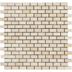
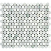
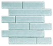
The Definitive Guide to Grout Color for White Tile
White tiles are timeless and make any space feel bright and open. But the grout you pair with them can completely change the look:
Matching White Grout
It creates a seamless, clean, and modern finish. Perfect for a minimalist bathroom or a space where you want a seamless look. Keep in mind, white grout shows dirt faster and will need more cleaning.
Light Gray Grout
It gives you a soft contrast while still feeling fresh. This is great for those who want subtle definition without heavy maintenance. Light gray works well with both floor tiles and backsplash tiles, making it a practical choice for kitchens and bathrooms.
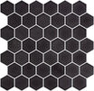
Dark Gray or Black Grout
For a bold, graphic look, pairing white tile with dark grout makes each tile pop. This works well with grout for subway tile designs or feature walls, giving your space a modern, statement-making feel.
Pro Tip: Many homeowners today prefer light to medium gray because it looks elegant and requires low maintenance.
Are you looking for the perfect white tile?
Check out Mosaicenter Floor Tiles that look beautiful with smart grout choices.
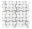
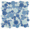
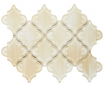
Grout Color Ideas for Gray Tile

Gray tiles are versatile and stylish, and the right grout can either highlight or soften their presence:
Matching Gray Grout
Matching gray grout gives you a calm and cohesive look that lets the gray tone shine. This creates a modern, understated feel that works well in large rooms or hallways.
Lighter Grout
Lighter grout brightens darker gray tiles, adding a fresh feel while keeping the space elegant. This combination works well for both walls and kitchen backsplash grout colors.
Darker Grout
You can add a subtle contrast with deep gray or charcoal grout; it creates depth without overpowering the space. This is also a practical choice for high-traffic areas, as it hides stains and marks well.
Tip: Always test a small area first. The undertone of your gray tile (cool or warm) should match the grout for a harmonious tile-and-grout combination.
Check out Mosaicenter Backsplash Tiles, and see how thoughtfully paired gray grout can make your kitchen or bathroom look better.
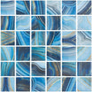
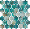
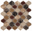
Grout Color Ideas for Wood-Look Tile
Wood-look tiles make any room look warm and feel natural. Here are some of the grout color ideas that complement wood-like tiles:
Matching Earth or Warm Neutrals
Using grout in earthy or warm shades keeps the look continuous, just like real wood. This works really well in living rooms and open spaces.
Subtle Gray or Beige
These colors give a balanced look and gently highlight the wood pattern without breaking it up.
Darker Grout (Mocha, Taupe, Brown)
These make each tile stand out, add depth, and hide dirt or stains. Great for floors that get used too often.
Tip: Always try a small grout sample on your tile in the room’s light. This way, you’ll see exactly how it will look once finished.
For natural, beautiful results, explore Mosaicenter Floor Tiles.
Rule #3: Practical Considerations & Pro Tips
Even though how grout will look and the visual effect it will have, has a major impact on grout choice, you should also consider how the grout holds up over time, how easy it is to clean, and how the room is used. Following tips and considerations will help you make the right choice:
What is the Easiest Grout Color to Keep Clean?
Medium gray and other mid-tone shades like beige or taupe are generally the easiest grout colors to keep looking clean. They hide dust, dirt, and light stains better than very light or very dark grout.
- Light grout (white, cream, very light gray) looks fresh and bright but shows dirt, spills, and stains quickly, especially in kitchens and bathrooms.
- Dark grout (black, charcoal, deep brown) hides dirt well, but soap scum or mineral deposits can sometimes show in wet areas.
- Medium/neutral grout balances both: it blends nicely with tiles, hides dirt, and keeps the room looking clean.
Using mid-tone, stain-resistant grout is smart in busy areas like kitchen floors, bathroom walls, or entryways. It gives you beauty without the constant cleaning hassle.
Light Grout vs. Dark Grout: The Pros & Cons

Light grout vs. dark grout come with their own pros and cons:
|
Features |
Light Grout (White, Cream) |
Dark Grout (Charcoal, Black) |
Neutral / Mid-Tone Grout (Gray, Beige, Taupe) |
|
Best Use |
Small rooms, calm look |
High-traffic areas, bold statement |
Most spaces, practical & stylish |
|
Look |
Airy, seamless, clean |
Dramatic, modern, makes tiles pop |
Balanced, timeless, works with many tiles |
|
Maintenance |
Shows dirt easily, needs frequent cleaning |
Hides dirt but may show soap or mineral residue |
Very forgiving, low maintenance, hides dust and stains |
|
Considerations |
Can discolor over time |
Can fade in sunlight, may show residue in wet areas |
Safe choice, works for bathroom grout color ideas or kitchen backsplash grout colors |
When picking a color, think about the room. Busy kitchens or high-traffic floors often do better with medium or darker grout. Light-colored grout can work well on walls, backsplashes, or low-use areas to keep a bright, open feel.
Other tips for practical grout use
- Seal your grout: Cement-based grout is porous. Sealing it protects from water, stains, and makes cleaning easier.
- Consider epoxy grout: For wet areas like showers or kitchen backsplash grout colors, epoxy grout is strong, stain-resistant, and doesn’t need sealing.
- Test before committing: Grout color can look different in your room’s lighting. Always try a small sample on your actual tile first.
FAQs
Q: Should grout be lighter or darker than tile?
A: It depends on the effect you want. If you want your tiles to stand out, choose a darker or lighter contrast grout than the tile. This makes patterns and shapes pop, like white subway tiles with dark gray grout. If you prefer a seamless, unified look, pick a grout that closely matches the tile color, so the surface looks smooth and continuous.
Q: What is the most popular grout color?
A: Today, medium gray or other mid-tone neutral grouts are very popular. They offer a balance between style and practicality. Gray works with white, gray, or even wood-look tiles, hides dirt well, and blends nicely with most decor.
Q: What color grout is easiest to keep clean?
A:Medium gray, beige, or taupe are the easiest to maintain. These mid-tone colors hide dust, light stains, and spills better than very light or very dark grout.
Q: Does white grout get dirty easily?
A: Yes, white grout looks fresh and bright, but it shows dirt, dust, and stains quickly, especially in wet or busy areas like showers, kitchens, and bathrooms. You will need to clean and seal it regularly to maintain that crisp, seamless appearance.
Q: How does grout color affect the look of a room?
A: Grout color changes the way your tiles and space feel:
- Contrast grout makes tiles stand out and creates a bold, statement look. It emphasizes patterns like herringbone, subway tiles, or mosaics.
- Blending grout creates a seamless look, that makes spaces feel larger, open, and calm. It works well for large tiles, wood-look tiles, or subtle designs.
Over to You
Choosing the right grout color doesn’t need to be stressful. First, decide if you want your tiles to stand out with contrast grout or blend in for a smooth, seamless look. Then, check out different tile-and-grout combinations. White, gray, black, and wood-look tiles all have colors that can change the feel of your room. Also, think about daily use. Mid-tone grouts like gray or beige are easy to keep clean and hide dirt well.
With these simple steps, your space can feel clean, stylish, and just the way you want it.
Find the perfect tiles with Mosaicenter Floor Tiles and Backsplash Tiles today!

Halil I Oguz
At Mosaicenter's, Halil I Oguz brings a unique blend of strategic insight and creative flair to our digital experience. As our dedicated Founder & Tile Expert, he masterfully curates the online journey, allowing the inherent quality and design artistry of our premium tiles to truly shine.
From showcasing the intricate patterns of our mosaics to detailing the robust, scratch-resistant and water-resistant finishes of our porcelain and natural stone, Halil crafts content that is both informative and deeply engaging.
His work empowers Mosaicenter's clients to confidently select from our extensive range, helping them transform spaces with tiles that reflect both enduring style and practical excellence.

Leave a comment
This site is protected by hCaptcha and the hCaptcha Privacy Policy and Terms of Service apply.